
MADELIN’S LOGO & BRANDING
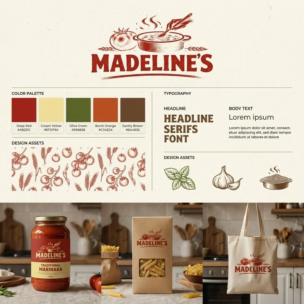
Madeline’s visual identity is a study in modern-heritage design, created to bridge the gap between traditional Italian craftsmanship and contemporary retail aesthetics. By pairing hand-drawn, woodcut-style illustrations with a warm, earthy palette of deep red and olive green, the brand evokes an immediate sense of authenticity and "not-too-precious" rustic charm. The goal was to establish a premium yet approachable presence that highlights the quality of small-batch ingredients through clean typography and purposeful, textured layouts. This cohesive identity ensures the brand feels established and timeless across various touchpoints, from digital platforms to physical packaging.